Costco Redesign
As Design Lead for UIUC Design Innovation's Costco redesign, I directed the team through a full mobile app overhaul, from paper wireframes and leading “How-Might-We” framing exercises, to a built-from-scratch design system, to high-fidelity redesign of Costco's mobile application.
Costco app suffers from Information overload, key features weren't visible or easy to access, and the overall experience wasn't time-efficient for grocery shoppers.
Redesign Costco's core app flows around a clear design system, making shopping, services, and account management feel simple.
From sketch to system to screens
A semester-long redesign from August 2025 - December 2025
Defined 3 How-Might-We statements to guide the redesign: 1) How might we make shopping feel less overwhelming?
2) How might we surface relevant features?
3) How might we make the Costco shopping experience more time-efficient?
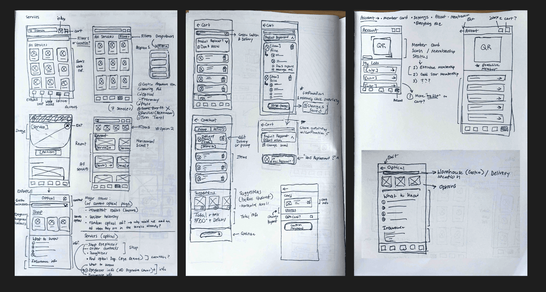
Sketched every core flow by hand, including Services, Cart, Explore, Warehouse, Shop, and Account, annotating pain points and options directly on the page before designing in Figma.
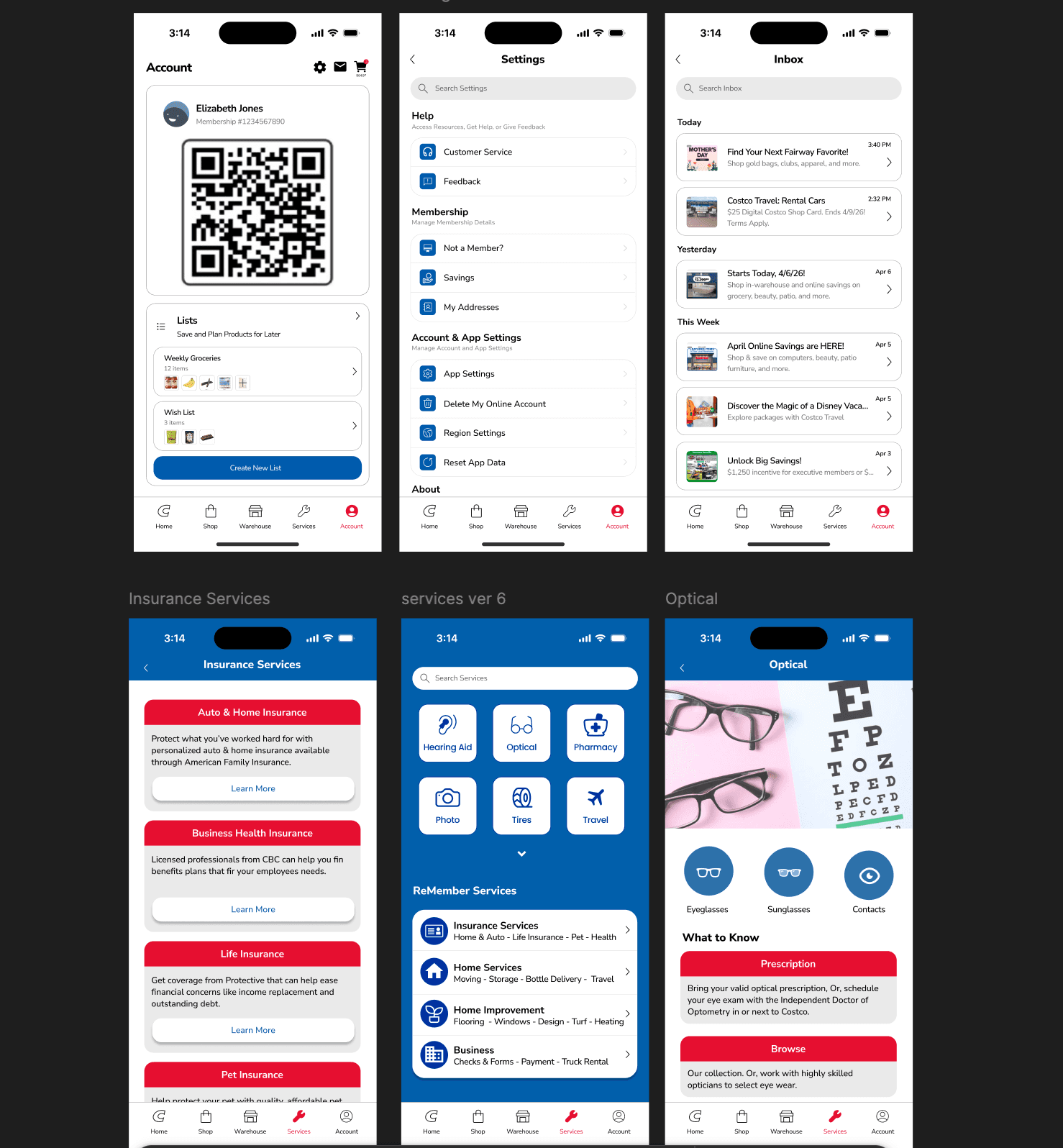
Built a full design system in Nunito Sans, including Costco Red & Blue as brand colors, a defined type scale, and core icon components.
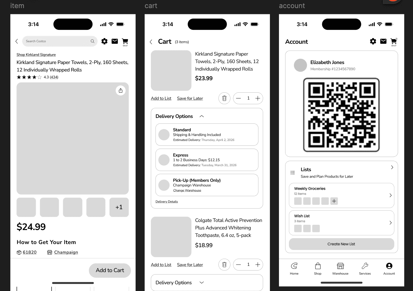
Designed over 30 redesigned screens with clear delivery options, pricing, and a scannable member QR code, applying the new design system end-to-end.
Presented final mobile redesign at final Design Innovation Checkpoint, receiving feedback on design consistency, navigation changes, and overall team unity.
Design the system before the screen.
Leading this redesign reinforced how much a defined design system de-risks every screen that follows. Once Costco's colors, type, and components were established, the team could move with intention and consistency.
Like what you see?
Let's talk about how I can bring this same impact to your team.